Remaking Color
About the project
Remaking Color is a data visualization thesis that examines how the color identity of cinema shifts over time by studying the posters of film remakes: movies that share the same story but were marketed decades apart. Because movie posters condense a film's identity into a single image, they offer a controlled way to isolate how chromatic aesthetics evolve while the underlying narrative stays constant. The project treats poster color as a historical signal, tracing how promotional imagery reflects the technology, culture, and visual taste of its era.
Process
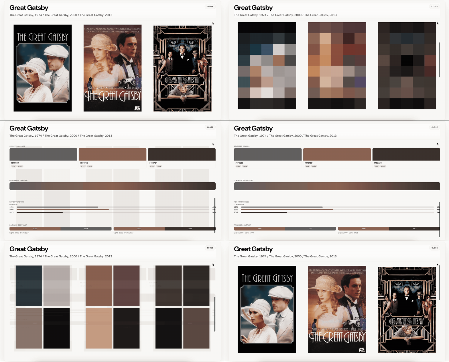
The dataset was built by cross referencing the Wikipedia remakes database with poster images and metadata pulled from The Movie Database (TMDb) API, resulting in 1,025 films across 488 remake families after filtering out television entries and titles missing from TMDb. Each poster then moved through a four stage color extraction pipeline in Python: dividing the image into an 8x5 grid and applying K means clustering to find a representative color per cell, reducing those 40 colors to a simplified 4 color palette, and finally distilling a single dominant color using both perceptual (HLS weighted) and mathematical centroid methods. That structured color data was then brought into JavaScript to build a set of interactive visualizations for the web.
Solution
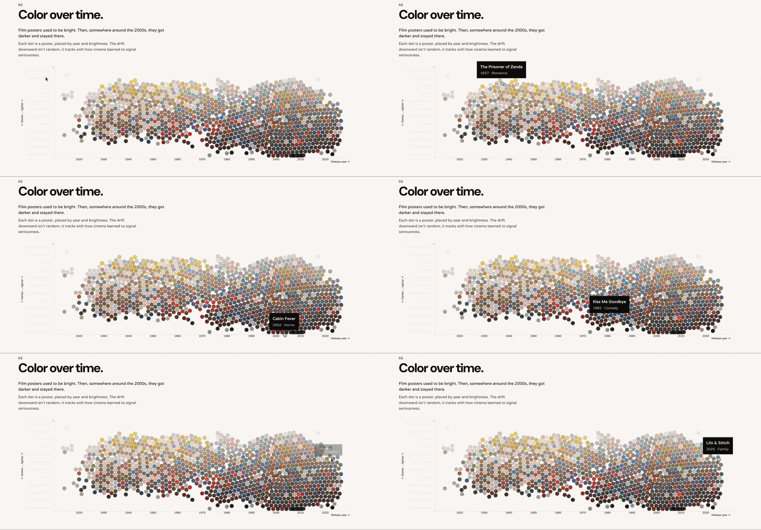
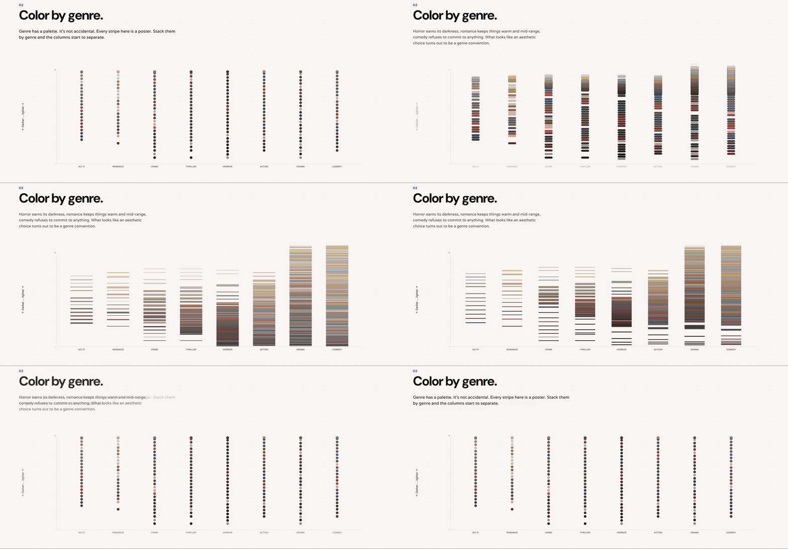
The final piece is an interactive visual essay with several comparative views: a timeline that lets viewers select a remake family and see its palette evolve across decades, a bubble chart plotting brightness against release year across the full dataset, a stacked bar chart showing each genre's chromatic signature, and a side by side "Atlas of Remakes" gallery comparing original and remake dominant colors directly. Together these views turn an abstract claim, that movie posters look different now than they used to, into something visible, explorable, and measurable.
Discoveries
The clearest pattern across the dataset is a consistent drop in brightness and saturation: modern remakes trade the vivid primary palettes of mid century posters for darker, moodier, more digitally graded looks. Genre shapes color in persistent ways too. Horror and thrillers stay dark across every era but grow more desaturated and "realistic" over time, while action posters converge on high contrast teal and orange combinations built for visibility on small screens. Some remake families preserve their original color story almost intact, while others undergo a total chromatic overhaul to signal a tonal break from the original. Taken together, the data confirms a paradox: even with more color technology available than ever, contemporary poster design has narrowed toward a more standardized, darker visual language.